Salora Essential Oils
Fall 2023 | Client (Oil Life)
About: Salora leads the essential oil industry with a commitment to quality, integrity, and sustainability. From carefully sourcing the finest raw materials to partnering with organic and sustainable growers, every step ensures that each drop of oil remains pure and potent, just as nature intended.
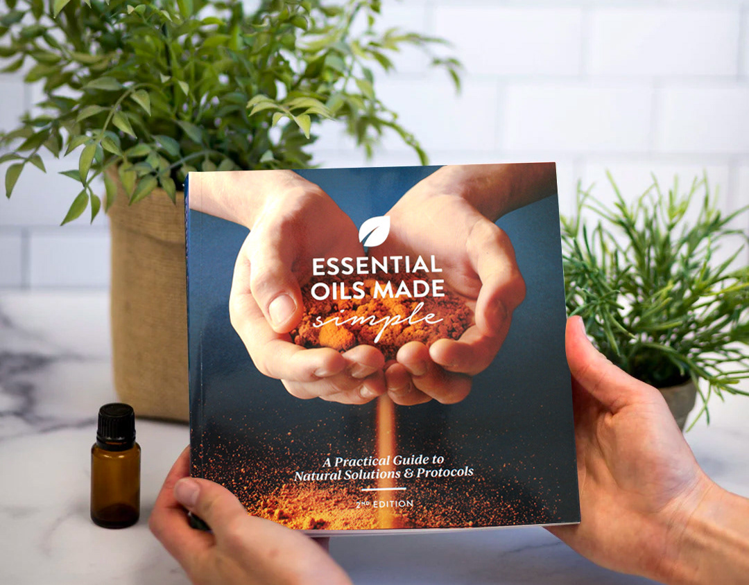
Overview: The Salora Essential Oils packaging was designed to reflect minimalist sophistication, using a clean black-and-white aesthetic accented with subtle pops of color. This refined approach keeps the focus on the oils’ purity and quality. The starter kit, featuring a selection of essential oils and a 40-page guide, was designed for clarity and ease of use, making it simple for customers to explore the brand.
Approach & Solution: The packaging design balances elegance with practicality, ensuring a modern yet accessible experience. The black-and-white palette creates a premium, clean look, while color accents differentiate oils without overwhelming the design. The starter kit layout was carefully structured to enhance functionality, featuring a detailed guidebook that offers education alongside the product. My approach was to strategically highlight this balance, ensuring the design felt both sophisticated and user-friendly.
Outcome: The final design merges minimalist aesthetics with thoughtful functionality, creating a visually refined and intuitive packaging system. This approach strengthens Salora’s brand presence, reinforcing its reputation as a trusted leader in essential oils while offering an experience that is both elegant and accessible.
Credits: Designed by Katrina Sutton (Owner of Lettermuse Studio) / Direction by Debbi Wootan and Jason Plant
